Anthony Dillon
on 27 July 2022
The Web and design team at Canonical runs in two-week iterations building and maintaining all of the Canonical websites and product web interfaces. Here are some of the highlights of our completed work from this iteration.
Sites
The Sites team develops and maintains most of Canonical’s sites like ubuntu.com, canonical.com and more.
Release of the Global nav v3.0
We recently released a new version of our global-nav JS module, a utility that adds a dropdown menu featuring links to all of Canonical’s products in a central location.
Up to now, the global-nav has appeared as a completely separate element that sits above all other site content:

The new version, v3.0, features the same content, but is specifically designed to integrate with the recently updated Vanilla navigation pattern, where it appears as another navigation item labelled “All Canonical”:

This will be rolled out to all of Canonical’s sites in the very near future.
Brand
The Brand team develop our design strategy and create the look and feel for the company across many touch-points, from web, documents, exhibitions, logos and video.
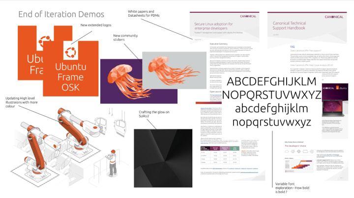
In this iteration we interviewed some agencies to help with the new Canonical brand rollout, we will choose which one to work with very soon. We also reviewed the initial work completed on our new variable font, it’s early days but we are excited that this work is underway. We have also been looking at how our new illustrations work when required for use in animations.
BAU work this iteration has included whitepapers and datasheets, along with some new community stickers for the Jammy Jellyfish release. Finally, we have been planning and reviewing a new animation for our automotive work.
The image below shows a selection of this work.

Commercial
The Commercial team maintains and develops all commercial service UI’s provided by Canonical. Including the Ubuntu Advantage store and our CUE certification.
CUE alpha internal testing
Rework the Anbox application update
We’ve worked on the Anbox user interface to simplify the task of updating Application settings. The new design has fewer editable fields, all changes are reflected in the current version of the application instead of creating new ones, and the APK file no longer needs to be re-uploaded.
For more information about how to get started visit the Anbox cloud website.

Further improvements to the UA subscribe view
The UA subscribe view is where you can select and purchase your UA subscription from the website. We’re still in the design and research phase of the UA subscribe view, following multiple rounds of iteration and user testing. We’re hoping to complete this design work really soon and begin the UI build.

Refactored the UA selection UI to React
In preparation for the redesign of the UA subscribe view as well as to be more easily shared between marketplaces, the product selector has been written in React.
MAAS
The MAAS team develops the UI for the MAAS project.
MAAS UI demos
MAAS UI demos are now live. This means that a new test site demonstrating changes to MAAS UI gets automatically created and is available within minutes after creating a pull request.
This makes the QA process considerably faster giving our developers and designers extra time to focus on delivering new features.
MAAS UI demos serve a production bundle and run on a full MAAS instance making sure we’re testing as close to the “real thing” as possible.
MAAS identity
Users of MAAS are often found to be running more than one MAAS instance at a time, with each having a different purpose e.g. production, development, and testing. Previously in the UI, the only way to distinguish between the different MAASes was to check either the URL, or the instance name in the status bar, which can be super easy to miss on large screens. This can lead to errors, since actions may be performed on one MAAS that was intended for another one. We wanted to create a way of more easily distinguishing different MAASes to help prevent these errors in the future.
To achieve this, we made three changes to the UI:
- Implement an information tooltip in the Configuration settings page informing administrator users on how to configure a MAAS name to make it easier to distinguish, including the use of emojis
- Change the colour of the status bar to (i) be compatible with the future MAAS UI and (ii) make the site name more visible (as the bar won’t blend with the background of the main page as much)
- Allow administrator users to change the colour of the site header from this page using a predefined colour palette.


Marketplace
The Marketplace team works closely with the Store, Snapcraft, Snapd and Desktop teams to develop and maintain the Snap Store and Charmhub.
Star Developers
After a long time in the works, Snapcraft now supports Star Developers.
What is a Star Developer? In the blog post, Star Developers are here! Holly explains, “The idea behind this feature is to celebrate and highlight active, responsible participants of the community.”
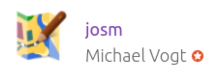
But how do you know who a Star Developer is? In search results and snap listing pages, you’ll see a white star in an orange circle next to the publisher’s name.

We’re in the early stages of the feature so there aren’t many Star Developers yet, but if you want to find out more, or become a Star Developer read Holly’s blog post and forum post that outlines the policy. Happy snapping.
Snapcraft and Charmhub review
When we started working on Charmhub, the idea was to use what we learned designing and building Snapcraft as a base, reusing as many components as possible. Unfortunately, as is the case in most projects, designs, and implementations diverged to meet the specific need of each marketplace. Now, with Snapcraft being stable, and Charmhub being more fully featured, it’s time to take stock, spot patterns, and pull the two sites back together.

The work is split into various stages, the first being documentation. In this iteration, we’ve been focused on identifying features that are common or should be common, to both sites and exploring the differences and potential directions to take both sites.
Once the documentation stage is complete, we’ll move on to writing guidelines and best practices, followed by the implementation to bring both sites into alignment. This won’t be a fast process, but we’ll post updates as and when we have something to share.
Charmhub interface pages
We have been working on a new page template for interfaces on charmhub.io. This project request came after the work we did for the integrations tab on charm pages.
Integrations are handled through interfaces which define and test the schema two charms use to ‘talk’ to each other.
One goal of having interface pages is to help operators understand these schemas and whether the charms they want to relate will work together. The second goal is for developers to have a grab-bag of interfaces that they know will help their charm relate with others seamlessly. It is essentially a specification for how the interfaces are supposed to behave, and what charms require/provide that interface.
Sharing the decision-making on how existing interfaces should be standardised and what new interfaces are needed is critical for the cross-relation ecosystem to grow, as such community engagement is encouraged on the pages. The user will be able to contribute with content for the pages, or file bugs, through the project repository on GitHub.
This project is still a work in progress, currently under UX review.

Workplace engineering
The Workplace Engineering team builds data products that help people make better decisions about people. We work with the Human Resources department, building internal tools to make life easier for every employee at Canonical.
User research
The User Research team works with the design and product management, to provide insights into our users’ needs and tools for teams to conduct their own research.
Ubuntu Desktop installation experience
In this iteration, we’ve been conducting interviews and exploring analytics to better understand the experience of installing a wide range of popular and important software on the Ubuntu Desktop, via the Snap Store and other routes. We aim to understand how to improve discoverability, trust and performance.
Stepper pattern
We’ve also been validating the design of a new stepper pattern. The stepper pattern will indicate the number of steps involved in the process and which one you are currently on. This is planned to be included on our sites soon, including tutorials and installation guides, to guide and set users’ expectations through different processes.
Take part in user research
If you would like, please join our user testing group.
Systems
This is a newly emerging team that handles the team’s tooling, process and infrastructure. Maintaining mission-critical systems such as assets, our k8s cluster, and much more.
Server docs PDF generation
We used to have a server docs PDF built daily from the source documentation but this cron job got lost in an update. So we needed to rebuild that. This script now downloads the source, converts the content using pandoc and uploads that to the assets server.
The new version of `dotrun`
Our team uses a tool called “dotrun” to develop Node.js and Python projects. This tool makes use of standard `package.json` script entry points. The new version of Dotrun uses a Docker image to provide a predictable sandbox for running Node and Python projects.
If you are interested, have a look at our dotrun repository.
Team posts:
- UX Deep Dive: Classify interactions for a more intuitive user interface by Will Grant
- Does knowledge corrupt? by Robin Winslow
We are hiring!
Come and join the team. If you would like to learn more about the team, please read our blog and description.
With ♥ from Canonical web team.


